I recently worked on two presentations that included the word “Responsive” when talking about web page design.
So what is Responsive Web Design, why should you care, and how does ClubExpress help you achieve it?
In recent years, mobile device use has skyrocketed. You can no longer assume that your site visitors are viewing your web pages on a desktop or laptop computer screen.
Responsive Web design suggests that design and development should respond to the user’s behavior and environment based on screen size, platform and orientation. This approach helps make your web page look good on all devices (desktops, tablets, and phones). For example, you can no longer assume that the user’s screen is being viewed in landscape (horizontal) mode, it might be in portrait (vertical) orientation.
In the early days of web, designers would use HTML tables as a simple way to force row and column formatting. However, tables are not well suited to being responsive, so the current best practice is to use tables as originally intended: to format and display tabular data.
The underlying HTML web page language has many features that facilitate re-positioning of page item. However, one of the best features of ClubExpress is that when you are creating web pages, you can select from a list of layout row styles, which in turn builds the code behind the scenes (though experienced developers still have control over the source code it creates).
For web pages, ClubExpress layout rows use the HTML DIV statement. This yields a lot of flexibility, and allows us to configure several rows types as ‘stackable’.
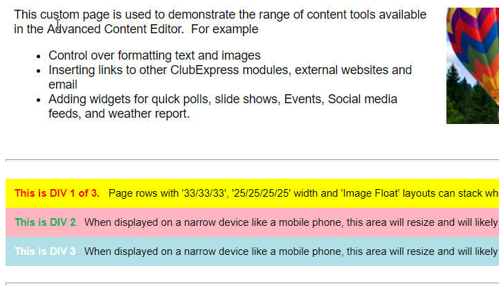
The “25/25/25/25” width, “33/33/33” width, and “Image Float” layouts can stack when the width is narrow. The other layouts, at this time, do not stack so they can be used where stacking is not desired.
Lets say I have place a row has three side by side “columns”, each container taking up 1/3 of the row width. When the page is wide, they display side by side. But if I narrow the browser page (or turn the display to portrait mode), the containers will be displayed as a stack of rows with the first one on top, followed by the others below it.
Here is the section of the page with three "columns" displayed as full width:

When the page is narrowed, the previous "columns" become rows of their own, and stack:
Each of the containers now takes full advantage of its new ‘row’ width.
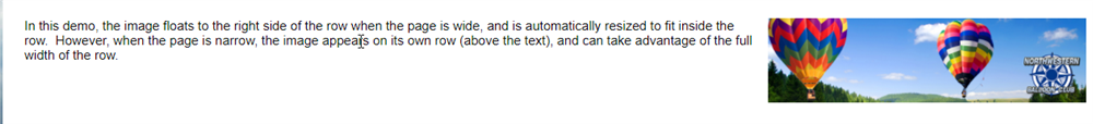
The Image Float row layouts make it very simple to keep an image displayed with its associated text, yet be responsive to the user’s current viewing setting. In this example a photo is being displayed within a row, as in this "Image Float Right" layout.
When the browser is wide, the image is resized to be part of the current row:
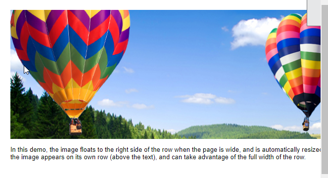
However, when the browser is narrow, the photo is displayed on a row of its own, and expands to fill the row… a good thing!
For more information, take a look at these two videos about using the Advanced Content Editor, and how to Manage Photos, Photo Albums and Web graphics for your organization.